Page 1 of 2
To take the attention out of the 6K for a bit...

Posted:
Mon Aug 12, 2019 1:21 pmby Ulysses Paiva
Hey, guys!
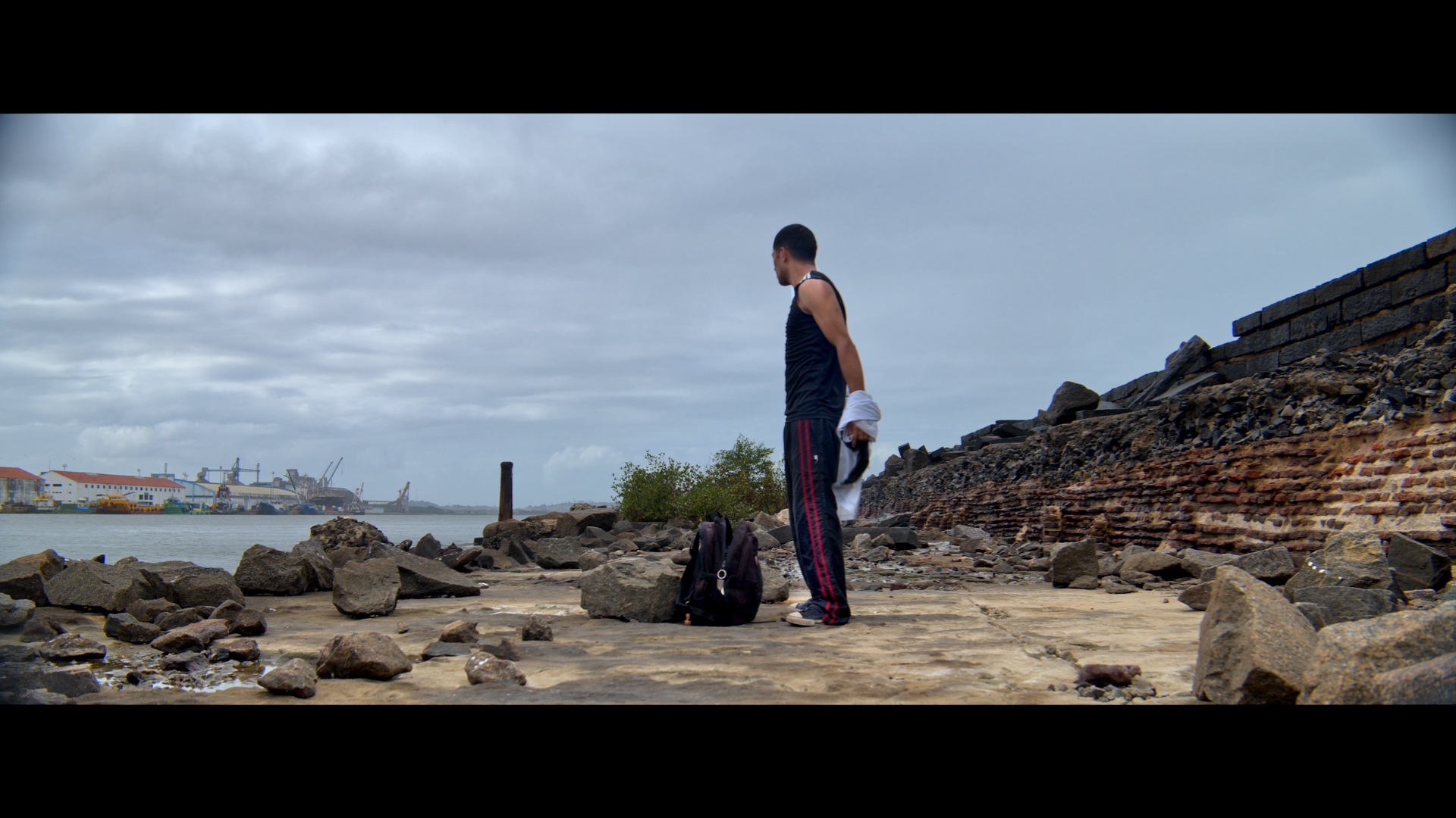
This is one of my first projects I shot with the Pocket 4K. Shot in anamorphic and no LUTs applied (Im not a LUT guy!).
Notice the audio in the very last shot. For the rest of the video, it is foley but for that shot It is from the stereo mics onboard, untouched, no EQ, no nothing. Listening from studio speakers, its a very nice ambience audio and definetely will be useful for a lot of projects.
Hope you guys enjoy spending 2 minutes of your life watching it. Thanks!
Re: To take the attention out of the 6K for a bit...
Posted:
Mon Aug 12, 2019 3:08 pmby Andrew Kolakowski
Lacks of sharpness/focus for me. His white outfit also changes white shade with about every shot and for some cuts it's just to blue for me.
How did you export it to youtube? Looks over-compressed (his face lacks of any details in about every shot).
Re: To take the attention out of the 6K for a bit...
Posted:
Mon Aug 12, 2019 3:16 pmby John Paines
Tastes will always differ, but to my eyes it looks like an unsuccessful rec. 709 conversion of BMPCC 4k log. You really might want to try the workflows proposed in that *other* thread.
Re: To take the attention out of the 6K for a bit...
Posted:
Mon Aug 12, 2019 3:29 pmby Ulysses Paiva
Andrew Kolakowski wrote:Lacks of sharpness/focus for me. His white outfit also changes white shade with about every shot and for some cuts it's just to blue for me.
How did you export it to youtube? Looks over-compressed (his face lacks of any details in about every shot).
Maybe its because the windowed 120p shots? They really do get softer. Focus was a bit hard with that anamorphic indeed and the weather was constantly changing. Not much effort in matching all shots together, more of a test. Still developing some grades for the P4K and not got to something definitive yet. Thanks for the feedback!
Re: To take the attention out of the 6K for a bit...
Posted:
Mon Aug 12, 2019 3:33 pmby Ulysses Paiva
John Paines wrote:Tastes will always differ, but to my eyes it looks like an unsuccessful rec. 709 conversion of BMPCC 4k log. You really might want to try the workflows proposed in that *other* thread.
Nah. No conversion at all. It was a 4 node only grade with a more natural approach. A lot of testing involved as I'm still developing some grades for the pocket. I'm at a version 5 for it and still didnt get to a definitive starting point for it. This 5th version was achieved after publishing this, meaning I have a newer version of this video but... the train has left the station. Ahahahah
Thanks for the input.
Re: To take the attention out of the 6K for a bit...
Posted:
Mon Aug 12, 2019 3:35 pmby John Paines
Ulysses Paiva wrote:Nah. No conversion at all.
That's the problem. The material was never put into the correct color space, before you started making adjustments. The result is a bit of a hybrid -- stretched log.
Re: To take the attention out of the 6K for a bit...
Posted:
Mon Aug 12, 2019 3:44 pmby Ulysses Paiva
John Paines wrote:Ulysses Paiva wrote:Nah. No conversion at all.
That's the problem. The material was never put into the correct color space, before you started making adjustments. The result is a bit of a hybrid -- stretched log.
Yeah, you're right. But I think it was the purpose for a natural approach using only the cameras color science and not converting it to anything? The lack of WB match between shots (weather, rushed and experimental grade) is part of what you're feeling?
Re: To take the attention out of the 6K for a bit...
Posted:
Mon Aug 12, 2019 3:51 pmby John Paines
Ulysses Paiva wrote:But I think it was the purpose for a natural approach using only the cameras color science and not converting it to anything? The lack of WB match between shots (weather, rushed and experimental grade) is part of what you're feeling?
You're not seeing the camera's color science at all; there's nothing "natural" about it. You're seeing the characteristics of log which, in theory, nobody but the grader is supposed to see. It is true that the 'log look' has become something of a style, particularly in very low budget stuff. The speculation is that directors got used to seeing log footage in the editing suites, and grew to like it. But there's a difference between doing it intentionally and being stuck with it.
Re: To take the attention out of the 6K for a bit...
Posted:
Mon Aug 12, 2019 4:06 pmby Brad Hurley
See
http://data.pleintekst.nl//Blackmagic_P ... og-footage(There are some important options missing from this guy's recommended solutions, notably Resolve Color Management, which is what I use, but overall the advice is useful; this was written for the original Pocket but the concepts apply to all log footage.)
Re: To take the attention out of the 6K for a bit...
Posted:
Mon Aug 12, 2019 4:06 pmby Andrew Kolakowski
Some high-end places start from LOG next to the client to pretend how much work is needed to get it to "correct" image


Re: To take the attention out of the 6K for a bit...
Posted:
Mon Aug 12, 2019 4:14 pmby Ulysses Paiva
Re: To take the attention out of the 6K for a bit...
Posted:
Mon Aug 12, 2019 4:18 pmby Ulysses Paiva
John Paines wrote:Ulysses Paiva wrote:But I think it was the purpose for a natural approach using only the cameras color science and not converting it to anything? The lack of WB match between shots (weather, rushed and experimental grade) is part of what you're feeling?
You're not seeing the camera's color science at all; there's nothing "natural" about it. You're seeing the characteristics of log which, in theory, nobody but the grader is supposed to see. It is true that the 'log look' has become something of a style, particularly in very low budget stuff. The speculation is that directors got used to seeing log footage in the editing suites, and grew to like it. But there's a difference between doing it intentionally and being stuck with it.
I see what your point is and I think I see what youre missing. In my case, I was favoring it. Long story short, Im gonna take that link down and put a new one with the newer in develpment version of approach. Will be grateful if you guys take the time to share some thoughts.
Re: To take the attention out of the 6K for a bit...
Posted:
Mon Aug 12, 2019 5:01 pmby John Paines
My advice is, don't invent a new workflow. Set up RCM -- takes about 10 seconds -- and make a habit of assigning the color input space to clips as soon as you import them to the media pool (select all, right-click> Input Color Space>Pocket 4K).
After that, any shortcomings in the footage will reflect deficiencies in cinematography or the deficiencies of the colorist. But not problems with the color space conversion, which you see in miles of posted BMD footage.
Re: To take the attention out of the 6K for a bit...
Posted:
Mon Aug 12, 2019 5:22 pmby Jamie LeJeune
John Paines wrote:My advice is, don't invent a new workflow. Set up RCM -- takes about 10 seconds -- and make a habit of assigning the color input space to clips as soon as you import them to the media pool (select all, right-click> Input Color Space>Pocket 4K).
After that, any shortcomings in the footage will reflect deficiencies in cinematography or the deficiencies of the colorist. But not problems with the color space conversion, which you see in miles of posted BMD footage.
It's good advice. Color management is important.
There are many approaches you can take.
If the project is destined for viewing online, color management could be as simple as working in Resolve's standard Davinci YRGB mode and using the "Extended Video" setting in BRAW (or applying the correct Extended Video LUT is working with BMD Film ProRes files) as a starting point for the grade.
If using one of the color managed modes in Resolve, I find ACEScct preferable to RCM. If you choose to work in RCM, be sure to set the "Timeline to Output Tone Mapping" and "Timeline to Output Gamut Mapping" options correctly for your source and output. The details for that are covered on p154 of the Resolve v16 manual.
Re: To take the attention out of the 6K for a bit...
Posted:
Mon Aug 12, 2019 5:40 pmby Ulysses Paiva
Re: To take the attention out of the 6K for a bit...
Posted:
Mon Aug 12, 2019 6:27 pmby Andrew Kolakowski
Better, but still the same problem for me- to blue in some shots. Even his hair have blue tint. Overall still not convincing, sorry.
Re: To take the attention out of the 6K for a bit...
Posted:
Mon Aug 12, 2019 6:39 pmby Tim Kraemer
Good job Ulysses!!
Re: To take the attention out of the 6K for a bit...
Posted:
Mon Aug 12, 2019 6:59 pmby John Paines
It's not an ideal case because the footage is windowed, but export a preferred uncorrected braw frame or two via Media Manager (or cDNG or Prores, if that what it is), and supply a link to it.
Re: To take the attention out of the 6K for a bit...
Posted:
Mon Aug 12, 2019 7:11 pmby Ulysses Paiva
Andrew Kolakowski wrote:Better, but still the same problem for me- to blue in some shots. Even his hair have blue tint. Overall still not convincing, sorry.
I guess its the waves spraying all over. I had to keep cleaning the lens everytime. Last shot with waves breaking at his back you can see that clearly. It starts with blacks balanced and then goes washed and a tint of blue (consequence of choices in the grading process). Thats why some shots also doesnt look sharp. It was shot on the Sigma 18-35mm, so... Well, it was an one man band shoot. Nothing special and thats why I didnt have a crew or other gear to help avoid those and other problems in this kind of scenario.
Re: To take the attention out of the 6K for a bit...
Posted:
Mon Aug 12, 2019 7:13 pmby Ulysses Paiva
Tim Kraemer wrote:Good job Ulysses!!
Thanks, Tim!
Re: To take the attention out of the 6K for a bit...
Posted:
Mon Aug 12, 2019 7:18 pmby Ulysses Paiva
John Paines wrote:It's not an ideal case because the footage is windowed, but export a preferred uncorrected braw frame or two via Media Manager (or cDNG or Prores, if that what it is), and supply a link to it.
Exported some frames for you to choose from.
https://we.tl/t-4RhMG7r7kV ")
Re: To take the attention out of the 6K for a bit...
Posted:
Mon Aug 12, 2019 8:22 pmby Andrew Kolakowski
I much prefer something like this:

nice warm clouds, brown face and black/brownish hair instead of nasty blue tinted ones. For me looks more "interesting", but it's just a look. You can create 1000s of them
You are master and can adjust original look way you want it- BRAW gives you nice headroom (although this shot does lack off resolution).
What is your monitor? Anything you can trust?
Re: To take the attention out of the 6K for a bit...
Posted:
Mon Aug 12, 2019 8:59 pmby Bunk Timmer
John Paines wrote:That's the problem. The material was never put into the correct color space, before you started making adjustments. The result is a bit of a hybrid -- stretched log.
You have to help me here. As far as I understand it, since he didn't do anything, he is working with Resolve YRGB colorscience . Resolve YRGB 32 bit colorscience drives the grading tools while we see the result in a rec 709 colorspace with a 2.4 gamma in the timeline. And as far as we know the result is meant for a rec709 2.4 gamma. How is it not put into the correct color space? What color space should it have placed in?
Thanks,
bunk
Re: To take the attention out of the 6K for a bit...
Posted:
Mon Aug 12, 2019 9:10 pmby Andrew Kolakowski
From LOG to Rec.709.
If you start with Log without LUTs/color management you need a bit of skills to get things to final Rec.709.
Ulysses results are not very convincing. If you are learning you wan to use LUT or ACES etc. to get closer to Rec.709 and then do adjustments. Straight Log to final Rec.709 is more for experienced people I would say.
Re: To take the attention out of the 6K for a bit...
Posted:
Mon Aug 12, 2019 9:21 pmby Ulysses Paiva
Andrew Kolakowski wrote:I much prefer something like this:
nice warm clouds, brown face and black/brownish hair instead of nasty blue tinted ones. For me looks more "interesting", but it's just a look. You can create 1000s of them
You are master and can adjust original look way you want it- BRAW gives you nice headroom (although this shot does lack off resolution).
What is your monitor? Anything you can trust?
Yeah, its exactly as you said. I was just avoiding that yellowish/greenish tint in the highlights, thats why the whites on his t-shirt got some blueish tint, I wanted the skies bluer. I could isolate it and stuff, but it would make the grade too specific and, sa I said, Im trying to develop and overall "my look" for the pocket so I can adjust from there for each project. Lately, Im trying to get an original look and get away from what is most done around there. I dont like "monotone" grades, the ones which takes colors out, like teal and orange, low sat ones, etc. I like colors, but nothing too fancy. Thats why I said Im going for a more "natural" look. Beeing said that, I like your grade. Used to do some things more towards what you did but todays Im experimenting more and grew a taste for a more natural, colorful (not oversaturated) grade.
I use a Calibrated Dell Ultrasharp as ref, an HDTV and another Dell as it came from factory, all 3 at the same time, to judge color. Its not that we were seeing differently, we were just pursuing different paths.
Re: To take the attention out of the 6K for a bit...
Posted:
Mon Aug 12, 2019 9:23 pmby Ulysses Paiva
Bunk Timmer wrote:John Paines wrote:That's the problem. The material was never put into the correct color space, before you started making adjustments. The result is a bit of a hybrid -- stretched log.
You have to help me here. As far as I understand it, since he didn't do anything, he is working with Resolve YRGB colorscience . Resolve YRGB 32 bit colorscience drives the grading tools while we see the result in a rec 709 colorspace with a 2.4 gamma in the timeline. And as far as we know the result is meant for a rec709 2.4 gamma. How is it not put into the correct color space? What color space should it have placed in?
Thanks,
bunk
Color converting is ONE approach. There are many. Depends on where you wanna go.
Re: To take the attention out of the 6K for a bit...
Posted:
Mon Aug 12, 2019 9:51 pmby John Paines
This is what RCM looks like, with some basic levels adjustments, mostly bringing down the sky. This is the starting point, with default saturation. Anybody can get to this point in 10 seconds. No skill, taste or knowledge of art history or cinematography is required. Where you go after this is up to you. But now you're in the correct color space, and CC controls will perform as expected.
Or, you can try to get to this starting point yourself, and see how it goes.
- u3_1.6.1.jpg (992.63 KiB) Viewed 5849 times
Re: To take the attention out of the 6K for a bit...
Posted:
Mon Aug 12, 2019 9:59 pmby Andrew Kolakowski
It's actually quite nice look.
Re: To take the attention out of the 6K for a bit...
Posted:
Mon Aug 12, 2019 10:05 pmby John Paines
No thanks to me! This is the camera's *actual* color science....
Re: To take the attention out of the 6K for a bit...
Posted:
Mon Aug 12, 2019 10:07 pmby Dune00z
John Paines wrote:This is what RCM looks like, with some basic levels adjustments, mostly bringing down the sky. This is the starting point, with default saturation. Anybody can get to this point in 10 seconds. No skill, taste or knowledge of art history or cinematography is required. Where you go after this is up to you. But now you're in the correct color space, and CC controls will perform as expected.
Or, you can try to get to this starting point yourself, and see how it goes.
u2_1.6.1.jpg
This is the exact look I strive for in general video production I create. Like explained here, it should take about 10 seconds. Looks very nice and natural and even if you are looking to do an additional flavor to it, its a great starting point.
Very nice look in my opinion and worlds better than a lot of the "very gray" looks I see on the web.
I strongly recommend heeding John's advice here.
Re: To take the attention out of the 6K for a bit...
Posted:
Mon Aug 12, 2019 10:27 pmby Steve Holmlund
Dune00z wrote:John Paines wrote:This is what RCM looks like, with some basic levels adjustments, mostly bringing down the sky. This is the starting point, with default saturation. Anybody can get to this point in 10 seconds. No skill, taste or knowledge of art history or cinematography is required. Where you go after this is up to you. But now you're in the correct color space, and CC controls will perform as expected.
Or, you can try to get to this starting point yourself, and see how it goes.
u2_1.6.1.jpg
This is the exact look I strive for in general video production I create. Like explained here, it should take about 10 seconds. Looks very nice and natural and even if you are looking to do an additional flavor to it, its a great starting point.
Very nice look in my opinion and worlds better than a lot of the "very gray" looks I see on the web.
I strongly recommend heeding John's advice here.
Yes, thanks for the demonstration, John. And to Ulysses for being so willing to supply some frames and take feedback.
Steve
Re: To take the attention out of the 6K for a bit...
Posted:
Mon Aug 12, 2019 11:12 pmby Andrew Kolakowski
John Paines wrote:No thanks to me! This is the camera's *actual* color science....
I know, but if you have not much experience you will never get to it quickly (or at all) with direct LOG to Rec.709 grade and this is the problem here. If footage is well shot then LUTs "fine" to use. Problems start when footage is not shot well.
Re: To take the attention out of the 6K for a bit...
Posted:
Mon Aug 12, 2019 11:35 pmby Ulysses Paiva
John Paines wrote:This is what RCM looks like, with some basic levels adjustments, mostly bringing down the sky. This is the starting point, with default saturation. Anybody can get to this point in 10 seconds. No skill, taste or knowledge of art history or cinematography is required. Where you go after this is up to you. But now you're in the correct color space, and CC controls will perform as expected.
Or, you can try to get to this starting point yourself, and see how it goes.
u3_1.6.1.jpg
Guys, arent we discussing taste and calling it right or wrong? John, with all due respect, sorry but I dont see much of a difference. Im not saying its not good though. Im used to using RCM and ACES. The thing is, thats not where I wanted to go... As John said, its basic, RCM helps to get to a balanced starting point quickly, but its not the only or right way to go. Can we at least agree to that? I also liked Andrews quick grade, but I could get to the same point tweaking my 3rd node in my chain. I'm just tired of that look and wanted to have a white sky, not tinted highlights. I got were I wanted but its always nice to have feedback as you never stop to learn and grow.
And Andrew, what you meant by "not convincing"?
Re: To take the attention out of the 6K for a bit...
Posted:
Tue Aug 13, 2019 12:59 amby ravirai
Ulysses Paiva wrote:New link:
Wow, I really like it! I also love the use of the music and how well it goes with the visuals. The ONLY thing i felt could have helped more is if the actor's face was in focus more than his legs (in some shots the face goes soft). But well done.
EDIT: I do love what John Paines did to the image. But this is well shot and edited and good taste in music. I like it!
Re: To take the attention out of the 6K for a bit...
Posted:
Tue Aug 13, 2019 9:15 amby Bunk Timmer
Andrew Kolakowski wrote:From LOG to Rec.709.
If you start with Log without LUTs/color management you need a bit of skills to get things to final Rec.709.
Ulysses results are not very convincing. If you are learning you wan to use LUT or ACES etc. to get closer to Rec.709 and then do adjustments. Straight Log to final Rec.709 is more for experienced people I would say.
Thanks Andrew for taking the time to answer. I was hoping that John would answer.
The moment you drop bm film footage in the timeline (default set to rec.709 2.4) your footage is already color managed as what you see is rec.709. It's just not 'normalized'. No one stops you from using RCM even if there are no colors to manage (no other footage, graphics to match) but it may give you the result John posted, blues turned too red, red stripes turned magenta, a white jacket turned blue ...and like Ray mentioned in another thread, now you have no clue what is causing it. White balance of, who knows? Of course you can turn the world upside down by claiming the sensor grows or at least it is well balanced out of the gate, but if I read correctly the sky as wel as some other basic stuf was adjusted, so no balance there either.
There must be a reason Blackmagic's training tutorial 'the Art of Colorgrading' isn't using RCM in any way.
https://www.blackmagicdesign.com/nl/products/davinciresolve/training Maybe because it learns you how to use the tools. It doesn't mean it turns you into a seasoned colorist but with time your grades will become better and better.
Ullyses film has some nice shots in my opinion, with a nice look. The reason not all look equally nice is caused by factors during the shoot. No RCM can help you there. You will have to adjust for that manually.
Re: To take the attention out of the 6K for a bit...
Posted:
Tue Aug 13, 2019 9:46 amby Andrew Kolakowski
Yes, but all of this needs skills. It's not necessarily that easy to get grade straight from LOG. I think my and John's point is that with ACES or RCM it would be easier, specially when you are not colorist with 15 years experience.
For me those grades don't look good and it's not about the taste. Blue tint on hair is noting nice (is this how it looked in reality?). Old days a lot of RED footage had those nasty blue tinted shadows. Looks digital and bad for me, but what more important easily fixable. Whites in some shots instead of going to details are flat. Shot at 20 sec in stands out from others by miles (with pushed saturation etc). Look at clouds in next shot- they should look about the same. Then we have next one wich is also oversaturated and then back to other look. Many shots lack contrast compared to others. It's all just not well balanced as whole piece (regardless that I don't like the way how it looks either).
Re: To take the attention out of the 6K for a bit...
Posted:
Tue Aug 13, 2019 11:27 amby Andrew Kolakowski
More blue version:

your version for reference:

maybe you will understand wat I'm talking about (clouds, hair etc.).
Re: To take the attention out of the 6K for a bit...
Posted:
Tue Aug 13, 2019 12:20 pmby John Paines
Bunk Timmer wrote:John Paines wrote:That's the problem. The material was never put into the correct color space, before you started making adjustments. The result is a bit of a hybrid -- stretched log.
You have to help me here. As far as I understand it, since he didn't do anything, he is working with Resolve YRGB colorscience . Resolve YRGB 32 bit colorscience drives the grading tools while we see the result in a rec 709 colorspace with a 2.4 gamma in the timeline. And as far as we know the result is meant for a rec709 2.4 gamma. How is it not put into the correct color space? What color space should it have placed in?
All that happens with DaVinci YRGB/rec 709 output is that you've set the output standard for the display. But give it footage which doesn't conform to rec. 709 standards (like log), and it'll look funny. What happens in RCM (or ACEs) is that a complex operation is performed to convert what amounts to a mathematical representation of the footage designed to achieve dynamic range efficiencies ("log"), to one which conforms to rec. 709 expectations -- i.e. the norms we're accustomed to seeing on TV, where material falls with a certain range and there are widely accepted standards of what's acceptable and what isn't.
If you have the skills of that lady in the BMD video, then great: do it yourself from scratch. But consider what people actually do. Footage typically has the look of material which was insufficiently transformed from log -- weak or strange contrasts, diluted colors, milky tones, etc.. People can claim they prefer this result, but it remains an artifact of an acquisition format (log) which nobody was ever supposed to see in public. It's like putting on a shirt backwards and saying, well, I like it better that way.
Using RCM or ACEs is not cheating. ACEs was not developed by the industry for consumer use. You're not getting some compromised or lesser result by doing it. You still have to grade the shot. But at least you end up with something as good as a point and shoot camera might have given you. That can't be said of most of the "graded" BMD log footage which gets posted.
Re: To take the attention out of the 6K for a bit...
Posted:
Tue Aug 13, 2019 12:23 pmby Andrew Kolakowski
And if you look at my post above it shows it so well...
In many cases it's wasting camera and LOG attributes when you not planning to "develop" LOG properly.
Re: To take the attention out of the 6K for a bit...
Posted:
Tue Aug 13, 2019 12:54 pmby Brad Hurley
Bunk Timmer wrote:There must be a reason Blackmagic's training tutorial 'the Art of Colorgrading' isn't using RCM in any way.
https://www.blackmagicdesign.com/nl/products/davinciresolve/training Maybe because it learns you how to use the tools. It doesn't mean it turns you into a seasoned colorist but with time your grades will become better and better.
In fact if you download the .drp file for the project she's working with, it opens up with RCM applied in the project settings. The first two clips (the rhino and the clock, in the "balance clips" folder, bypass the input color space so you see them in log and she can illustrate how you can manually increase contrast, saturation, etc., but I assume that's to show the power of those tools in Resolve as well as to give you an understanding of how those tools operate. Try doing the same thing in Final Cut Pro and you'll see that you run out of space in the color wheels - you physically can't adjust contrast enough and you'll need to use curves or apply a camera LUT. Some of the match clips look pre-graded, and the rest of the clips use input color spaces that feed into RCM so you are working with Rec 709 as a starting point.
When I use RCM (which is all the time), I'm always applying additional primary and secondary corrections -- RCM isn't meant to get you immediately to a standard look and you're done. It gets you into a standard color space, and within that color space you further tweak the image to your liking. As Alexis van Hurkman says in the Color Correction Handbook, first you normalize (bring it into Rec 709 or whatever color space you're using) and then you adjust lift, gamma, gain, etc.
Re: To take the attention out of the 6K for a bit...
Posted:
Tue Aug 13, 2019 5:05 pmby Ulysses Paiva
My initial intention was just to share some anamorphic footage from the pocket, which Im guilty to not equalize between shots as it was not my main goal as long as it is a personal project and Im experimenting, not selling a finished product. Turned out to a good discussion. Thanks everyone.
Andrew, I feel you. You are correct. I just wasnt looking at it as you did because I had another goal doing this experimental video and thats why I didnt grade with local corrections as I still am developing a look for the pocket. But I should have published a more finalize version to avoid confusion as I do on my paid gigs.
Anyway, all exchange of knwoledge is healthy and I am always open minded.
Another big problem was the suddenly weather change and seawater spraying all over the lens, camera and monitor. Made it really hard to keep focus or a clean image. Has been a long time since I didnt shoot without crew and Im glad Im back to it, but rusty. Im gonna shoot another video soon and we can discuss further. Thinking about shooting some parkour moves around the town. Would you guys like to see it?
Re: To take the attention out of the 6K for a bit...
Posted:
Tue Aug 13, 2019 5:56 pmby Thomas Schumacher
Nice shots and drama! Colours can be corrected or changed to taste, but the film itsself is realy nice and well done, I liked it!
Re: To take the attention out of the 6K for a bit...
Posted:
Wed Aug 14, 2019 12:14 amby Ulysses Paiva
Thomas Schumacher wrote:Nice shots and drama! Colours can be corrected or changed to taste, but the film itsself is realy nice and well done, I liked it!
Thanks, Thomas! Next one will be a parkour video. Lets see what comes out. Ahahahaha
John, Andrew, what about now?
This one is sporting my v7 overral grade for the pocket. Previous was v5. I think Im finally getting where I wanted. This version was better translated to all other shots I have.
Re: To take the attention out of the 6K for a bit...
Posted:
Wed Aug 14, 2019 12:41 amby John Paines
Granted, there's no "correct" look for a music video, but I think that because of the way you're approaching the footage, there are elements you just can't get right.
The color and other aspects are still wrong to my eyes, and I think the reason is that it's not properly normalized at the outset. For example, in the one shot I did, I was pleased that his skin tone (on the arm) came out decently "as is", without any attention to it. But in yours, his face is all wrong. Of course, these are completely different shots and very different lighting, which I didn't attempt. So there's that.
But how about you try it my way? Do it with RCM, *then* give it the particular stylized look you want. And see how the color holds up.
Re: To take the attention out of the 6K for a bit...
Posted:
Wed Aug 14, 2019 1:07 amby Ulysses Paiva
John Paines wrote:Granted, there's no "correct" look for a music video, but I think that because of the way you're approaching the footage, there are elements you just can't get right.
The color and other aspects are still wrong to my eyes, and I think the reason is that it's not properly normalized at the outset. For example, in the one shot I did, I was pleased that his skin tone (on the arm) came out decently "as is", without any attention to it. But in yours, his face is all wrong. Of course, these are completely different shots and very different lighting, which I didn't attempt. So there's that.
But how about you try it my way? Do it with RCM, *then* give it the particular stylized look you want. And see how the color holds up.
Thats how I did it.
Re: To take the attention out of the 6K for a bit...
Posted:
Wed Aug 14, 2019 9:09 amby Andrew Kolakowski
Ulysses Paiva wrote:Thomas Schumacher wrote:Nice shots and drama! Colours can be corrected or changed to taste, but the film itsself is realy nice and well done, I liked it!
Thanks, Thomas! Next one will be a parkour video. Lets see what comes out. Ahahahaha
John, Andrew, what about now?
This one is sporting my v7 overral grade for the pocket. Previous was v5. I think Im finally getting where I wanted. This version was better translated to all other shots I have.
For me way better. Try to normalise saturation and contrast better. Some shots still stand out against others.
Last shots- get the horizon straight.
Re: To take the attention out of the 6K for a bit...
Posted:
Fri Aug 16, 2019 11:42 amby Bunk Timmer
Was some days away from my computer. Am back
Ulysses Paiva wrote:Thats how I did it.
Well there you have it. No insurence from RCM. It's also nonsense. If you open the RAW tab with DaVinciYRGB you get the exact same treat as when opened in DaVinci RCM except way more options in RAW tab and it's not match to some archived database within Resolve, wich you could think of as a LUT you can't see nor touch. After that every tool setting is converted to the colorspace you selected in the prefs. In this case rec.709 2.4.
If some one says he choose to for a certain look it's probably he choose for a certain look. If I open the 'monk' and do not touch color temp or tint it's some what blue-ish but no where near the grade Ulysses choose for. Set temp to 5200Kelvin and all is fine already. 'Normalize' on RAW tab and you can get a perfectly fine color correction without RCM. And even better you can choose to ignore the RAW tab and get the more or less the same grade with just one node.

- DaVinci YRGB
- BM_YRGB.jpg (139.01 KiB) Viewed 5253 times
...and here is the file.
Use RCM when ever you like but it's main purpose is to match colors from "art" coming form different departments/profiles within a pipeline. If you are an individual there is no real benefit over DaVinciYRGB at least not that I have noticed.
Re: To take the attention out of the 6K for a bit...
Posted:
Fri Aug 16, 2019 12:30 pmby John Paines
Bunk Timmer wrote:Well there you have it. No insurence from RCM. It's also nonsense. If you open the RAW tab with DaVinciYRGB you get the exact same treat....
Did you listen to nothing which was said?
RCM and ACEs do not stop users from making as much of a mess as they might like, post-normalization. And nobody claimed results achieved through RCM can't be obtained through other methods, though the example you've posted is a remarkably poor test case, for obvious reasons. Do you see much color and typical levels of variation and contrast in that shot? It also started off so badly, not much was required to make it more acceptable.
This has proven to be a notably useless discussion, over two threads now. But if you're happy with your results, using your methods, great. Legions of BMD youtubers agree, so there's that. It's funny to think that among large numbers of owners, a camera capable of recording log is producing worse results than most point and shoots, but again, whatever makes people happy.
Re: To take the attention out of the 6K for a bit...
Posted:
Fri Aug 16, 2019 2:03 pmby Wayne Steven
Ulysses Paiva wrote:Hey, guys!
This is one of my first projects I shot with the Pocket 4K. Shot in anamorphic and no LUTs applied (Im not a LUT guy!).
Notice the audio in the very last shot. For the rest of the video, it is foley but for that shot It is from the stereo mics onboard, untouched, no EQ, no nothing. Listening from studio speakers, its a very nice ambience audio and definetely will be useful for a lot of projects.
Hope you guys enjoy spending 2 minutes of your life watching it. Thanks!
Hi. It says no video, but I guess it is the one down further with the martial arts practice. Nice movement, nice subject, keep it up, but your avatar picture makes you look like you were kicked by that guy Ulysses.
")
Re: To take the attention out of the 6K for a bit...
Posted:
Fri Aug 16, 2019 4:19 pmby rick.lang
John Paines wrote:RCM and ACEs do not stop users from making as much of a mess as they might like...
Well said, and I do!
Sent from my iPhone using Tapatalk


