some GUI inconsistencies

Posted:
Sun Sep 13, 2015 11:23 amby michael vorberg
if i choose the neutral grey GUI the toolbar is still with the blue tint:

- grau.JPG (11.76 KiB) Viewed 1099 times
the values in the spline editor and timeline are hard to read with the dark blue background:
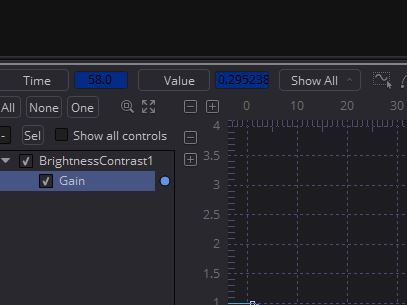
- spline_view.JPG (22.29 KiB) Viewed 1099 times
Re: some GUI inconsistencies
Posted:
Mon Sep 14, 2015 7:10 amby Stefan Ihringer
just adding some nitpicking about the skin in beta 2. I generally like the new one because it is more readable. On the other hand, there are some things that kinda irk me the longer I look at them...
This is on OSX where I know that text rendering is very different from Windows (most Windows users tend to be annoyed by the "blurry" text while most OSX users think Windows text rendering looks weird). But for example Photoshop on OSX has pretty crisp GUI text...
Re: some GUI inconsistencies
Posted:
Mon Sep 14, 2015 3:34 pmby Chad Capeland
The colors in the Spline Editor are assigned incorrectly, best I can tell. Instead of using the spline color, it uses some derivative of it. The same colors are used for the keyframe markers, and when a light blue spline gets a purple keyframe marker, it's confusing. I think if the colored backgrounds for the Time and Value inputs followed the spline colors (which are muted by default), then it would be easier on the eyes.
Regarding the fonts, it's not just blurry, it's not using subpixel-aware antialiasing. From your screencap, which is a jpg, not png, so I can't be certain if it is missing that, but without you'll have either really blurry text, or really ugly text.