Edit Page: Confusing UI for Lock/Sync/Solo/Mute icons

  • Author
  • Message
Offline
User avatar

Mel Matsuoka

  • Posts: 1181
  • Joined: Wed Aug 22, 2012 9:54 am
  • Location: Clarence, NY

Edit Page: Confusing UI for Lock/Sync/Solo/Mute icons

PostThu Nov 21, 2019 9:05 pm

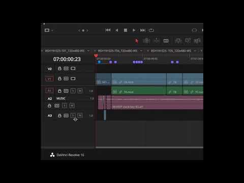
It's very confusing the way that the lock/sync/solo/mute icons on the Edit Page timeline audio track header change their alignment when expanding the track size to expose the track name:


It's very visually jarring, and breaks the user's expectations as to where commonly used UI buttons are located. The icons should always maintain relative alignment with each other, so that it's immediately obvious which tracks are locked, or have their sync lock enabled. It also adds mental friction every time I need to click the audio track header icons, as I need to always analyze where the lock icon is, for example, when I want to lock any or all the tracks.
Resolve Studio 18.0.2 / Decklink Mini Monitor / 14" 2021 Macbook Pro Max (macOS 12.5.1, M1 Max) / 32GB RAM
Offline

Jim Simon

  • Posts: 30221
  • Joined: Fri Dec 23, 2016 1:47 am

Re: Edit Page: Confusing UI for Lock/Sync/Solo/Mute icons

PostFri Nov 22, 2019 3:06 pm

I find the current behavior very workable. I also don't think there's another way to do it. The change is needed based on available space.
My Biases:

You NEED training.
You NEED a desktop.
You NEED a calibrated (non-computer) display.
Offline
User avatar

Mel Matsuoka

  • Posts: 1181
  • Joined: Wed Aug 22, 2012 9:54 am
  • Location: Clarence, NY

Re: Edit Page: Confusing UI for Lock/Sync/Solo/Mute icons

PostFri Nov 22, 2019 8:24 pm

Jim, I'm not saying that the current behavior doesn't work. I'm saying it doesn't work well, and is contrary to basic principles of good UI design.

Premiere Pro manages to do this in a sensible, expected way. In fact the reason why Resolve's behavior sticks out like a sore thumb to me is precisely because I've become used to nearly a decade of proper UI behavior in this regard, in Premiere:

Resolve Studio 18.0.2 / Decklink Mini Monitor / 14" 2021 Macbook Pro Max (macOS 12.5.1, M1 Max) / 32GB RAM
Offline

Jim Simon

  • Posts: 30221
  • Joined: Fri Dec 23, 2016 1:47 am

Re: Edit Page: Confusing UI for Lock/Sync/Solo/Mute icons

PostMon Nov 25, 2019 11:24 pm

I still think Resolve does it better than PP.
My Biases:

You NEED training.
You NEED a desktop.
You NEED a calibrated (non-computer) display.
Offline
User avatar

Mel Matsuoka

  • Posts: 1181
  • Joined: Wed Aug 22, 2012 9:54 am
  • Location: Clarence, NY

Re: Edit Page: Confusing UI for Lock/Sync/Solo/Mute icons

PostMon Nov 25, 2019 11:25 pm

Jim Simon wrote:I still think Resolve does it better than PP.


Of course you do.
Resolve Studio 18.0.2 / Decklink Mini Monitor / 14" 2021 Macbook Pro Max (macOS 12.5.1, M1 Max) / 32GB RAM
Offline

doobre

  • Posts: 17
  • Joined: Thu Dec 10, 2020 6:20 am
  • Real Name: Clive Delves

Re: Edit Page: Confusing UI for Lock/Sync/Solo/Mute icons

PostSat Dec 12, 2020 8:19 am

Kind of related Q.
I am brand new to DR in 16.1.2.017 and multicam in the edit page. four video tracks 6 audio tracks (4 embedded) in the video
Why when I mute the audio track (with the "M" in a box to the left of the timeline), is the corresponding video disabled ..???
I need to keep the embedded audio track in place to verify the sync etc, by popping the mute off, now and again.. but I don't want it to appear in the previewing or the final mix/export.
cheers CD
Regards CD
-----------------------------------------------------------------------------------------
HP i7-2600 3.4Ghz 16Gb - GTX1050Ti 4Gb - Win10

Return to DaVinci Resolve Feature Requests

Who is online

Users browsing this forum: jade film and 23 guests