Thanks for the replies.
The ineptitude of this design fits perfectly into the rest of Resolve's UI. Look at this:
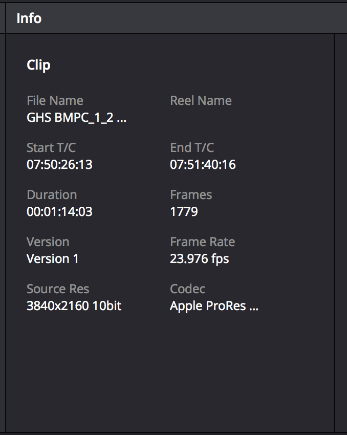
- Resolve stupid info.png (70.98 KiB) Viewed 3703 times
Why lay this already-narrow window out in two columns? There's not even room for the name of the codec, let alone a file. At least put the longer items on their own rows.
Thanks for the info about clicking under the thumbnails. Unfortunately the option is useless in many cases because of the limited space. One potential way to make it useful would be to let us show the
end of the filename, which is often a sequential number that may be enough to ID a file.
I do indeed get a ToolTip when hovering over the name in the info pane... merely emphasizing what a failure this layout is. The point is to show information; so why do we have to guess that we have to hover over a static text field then wait.... for yet another window to pop up showing us the information? ToolTips are not a valid solution to this problem because they're based on hovering and waiting... but if you're going to have them, why on earth not have them on
the clip thumbnails?


